

Why Does My Printed Colour Look Different From the Screen?

1. Why Do Colours Look Different on Screen and in Print?
I still remember when I first started working as an art director. I was sent to a printing company to check the colours of a print job.
We had to go to the printing factory at 12 midnight to check the colours. I was still very junior at that time. When I saw that the printed colours looked different from what I saw on the screen, this was the first question I asked.
Today, I still encounter the same question when I bring clients and designers to our printing factory in Malaysia to check colours.
Why does the colour on the screen look different from the actual printed colour?
To understand this, we first need to know the difference between RGB and CMYK. This is especially important when preparing artwork for packaging box printing in Malaysia.
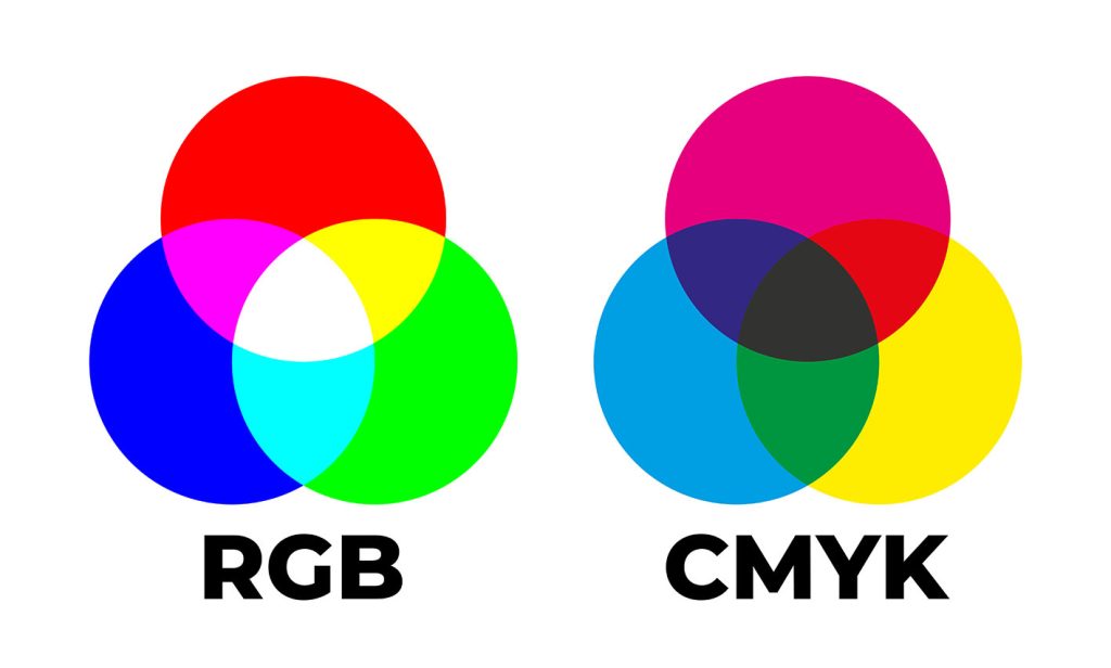
2. RGB vs CMYK: Understanding the Difference
RGB stands for Red, Green and Blue. Computer monitors, televisions and smartphone screens use RGB to display colours.
CMYK stands for Cyan, Magenta, Yellow and Black. These four colours are commonly used in commercial printing, including brochures, catalogues and packaging boxes.
The main difference is that RGB creates colours using light, while CMYK creates colours using printing inks.
When you mix coloured light, you can produce very bright colours. However, printing inks work differently. They absorb and reflect light from the paper surface.
For example, mixing cyan and yellow ink can produce green. Magenta and yellow can produce red or orange tones, depending on the ink proportions and printing conditions.
Because RGB and CMYK have different colour ranges, some bright colours displayed on a computer screen cannot be reproduced exactly using standard CMYK printing.
This is why a colour that looks bright and attractive on your monitor may appear duller when printed on a packaging box.
Before sending artwork to a printing company in Malaysia, it is important to understand this difference. It helps reduce misunderstandings and allows designers to make better colour decisions before production begins.
3. Why Some Colours Cannot Be Reproduced Exactly in Print
Some colours look extremely bright on screen. Examples include fluorescent green, electric blue and vivid orange.
Unfortunately, standard CMYK printing cannot reproduce every colour within the RGB colour range.
One option is to use a Pantone spot colour. Pantone colours are specified using individual colour references, allowing designers and printers to communicate more accurately about the intended colour.
For example, if your company has a corporate colour that must remain consistent across different printed materials, using a specified Pantone colour can help achieve better results.
Many international companies use Pantone colours for their corporate identity and product packaging. This helps maintain a consistent brand appearance across packaging boxes, brochures, name cards and other marketing materials.
For businesses investing in custom packaging box printing in Malaysia, colour consistency is important. Customers should be able to recognise your product through its packaging and brand colours.
However, Pantone colours are not a guarantee of an identical appearance in every situation. The paper, ink formulation, printing conditions and surface finish can still affect the final result.
An experienced packaging box printing company can advise you whether CMYK or a Pantone spot colour is more suitable for your project.
4. How Paper and Printing Materials Affect Colour
Choosing the right paper is another important factor in packaging box printing.
Imagine you are selling toys. The packaging needs to look attractive, with bright colours and sharp images, to catch the attention of children and their parents.
If you are selling beauty or skincare products, the packaging should look clean and attractive. The colours and images must help communicate the quality and positioning of the product.
On the other hand, if you are selling environmentally friendly products, you may prefer a more natural appearance, using subtle colours and an understated design.
The choice of paper can influence all these results.
Coated paper generally produces sharper images and more vibrant colours because its surface allows better control over ink absorption. Uncoated paper has a more natural texture and may produce a softer appearance.
The whiteness of the paper also affects colour reproduction. A paper with a warmer or more yellowish tone may make printed colours look different from those printed on a brighter white paper.
Finishing materials can also change the appearance of colours. Lamination, varnish and other coatings may alter the surface sheen and how light reflects from the packaging.
When planning packaging box printing in Malaysia, do not select paper based on price alone. Consider how the material will affect the final appearance of your product.
The right combination of paper, printing and finishing will help your packaging communicate the intended brand image.
5. How Printing Techniques Affect Colour Results
Over the years, digital printing and offset printing have often been compared. Some people believe digital printing will eventually replace offset printing.
However, both printing methods have their own advantages. The best choice depends on the quantity, artwork, budget and colour requirements of the job.
Offset Printing
Offset printing transfers ink from a printing plate to a rubber blanket before transferring it onto paper.
It is widely used for commercial printing and packaging production, especially when larger quantities are required.
One advantage of offset printing is that it allows the use of specially mixed Pantone spot colours. This is useful when a brand requires a specific colour that standard CMYK printing cannot reproduce accurately.
Once the ink formulation and printing conditions have been established, the printer can work towards maintaining the required colour throughout production.
Digital Printing
Digital printing produces images directly from digital artwork without requiring conventional printing plates.
It is useful for short print runs, samples and projects that require flexibility. It can also reduce setup time for smaller quantities.
However, digital printing machines generally use their own colour systems and printing profiles. Even when they reproduce CMYK colours, their results may differ from offset printing.
Digital printing may also struggle to reproduce certain Pantone colours exactly, depending on the machine and its colour capabilities.
If your packaging design contains an important corporate colour, discuss your requirements with the printer before choosing the printing method.
For some projects, digital printing is the more economical choice. For others, offset printing with a Pantone spot colour may be more suitable.
The important thing is to choose a printing method that meets your colour requirements and production budget.
6. Why Your Printed Colour May Differ From the Previous Print Run
Many years ago, one of our clients selling German R&D products asked us why their corporate blue looked different across various printing jobs.
They used different printing companies to produce their name cards, brochures, leaflets and other marketing materials.
After checking the situation, we discovered that their German headquarters specified a Pantone colour for their corporate blue.
We advised the client to use the same Pantone colour reference for their printed materials. This helped improve colour consistency across the different jobs.
The same principle applies to packaging box printing in Malaysia.
If your product packaging uses a prominent brand colour, it is worth discussing whether a Pantone spot colour is appropriate.
However, using the same Pantone reference alone does not guarantee identical results. Different paper stocks, printing machines, ink formulations and finishing processes can still cause variations.
Ink coverage, machine settings and printing conditions also affect colour consistency.
If you regularly reorder packaging boxes, keep records of the approved colour reference, paper specification, finishing and previous production details.
Where possible, provide the printer with an approved physical sample from the previous print run. This gives both parties a useful reference when checking the new production.
Good communication between the designer, customer and printer can help reduce unnecessary colour disputes and costly reprints.
7. Why Can Printed Colours Fade Over Time?
Colour problems do not always happen during printing. Sometimes, the packaging looks correct when it leaves the factory but changes after several months.
At Uniquelink Dot Print, we check the printed colours, folding and finishing before releasing packaging boxes to our clients.
After delivery, the boxes may be stored in a warehouse, used for packing products, transported through distribution channels and displayed on shop shelves.
During this period, the packaging may be exposed to sunlight, UV radiation, heat and other environmental conditions.
I remember a case where a client came back to us after several months because a very light printed colour had faded significantly, making it look almost white.
Very light colours can be particularly difficult to maintain because even a small change in colour strength may become noticeable.
However, fading depends on several factors, including the type of ink or colourant, paper, exposure to light and storage conditions. Heat alone is not necessarily the cause.
If your packaging uses very light colours, especially when the boxes may be exposed to strong light for extended periods, discuss the risks with your printer before mass production.
Depending on the application, you may need to conduct colour stability tests under suitable exposure conditions.
For products that require a long shelf life, testing can help identify potential problems before the packaging is produced in large quantities.
It is always better to identify a colour stability issue during testing than after the products have reached the market.
8. How to Get a More Accurate Colour Match
If you want your packaging box colours to look as close as possible to the approved design, there are several things you can do before production begins.
Prepare the artwork correctly. Make sure the artwork uses the appropriate colour mode and that the colour specifications have been discussed with the printer.
Use Pantone spot colours when necessary. If colour consistency is particularly important, ask whether a Pantone spot colour is more suitable than standard CMYK printing.
Choose the right paper. Different paper stocks can produce different colour results. Confirm the material before approving the final colour.
Request a printed colour proof. A physical proof provides a more realistic reference than a computer screen alone.
Check the proof under suitable lighting. Lighting conditions can affect how colours appear. Comparing samples under consistent lighting makes colour evaluation more reliable.
Use the same materials for proofing where possible. Ideally, the proof should use the same paper and relevant finishing materials as the final production. If this is not possible, ask the printer to explain the limitations.
For businesses ordering packaging box printing in Malaysia, discussing these points before approving the artwork can help prevent unnecessary delays and additional costs.
9. Why a Printed Proof Is Important Before Mass Production
After many years working in design and printing in Malaysia, I have learnt an important lesson.
“Always treat the easiest job with the utmost attention, because the easiest job is often the one we overlook. Mistakes can happen.”
A colour displayed on a monitor is only a reference. It cannot fully represent how the final ink will look on a particular paper surface.
That is why I never allow a printing job to proceed without checking the colour proof.
For packaging projects, I also request a packaging mock-up whenever appropriate.
A printed proof allows us to check the colours, images, text and overall appearance before mass production. A packaging mock-up allows us to check the actual box structure, folding, dimensions and how the artwork fits the finished packaging.
We can also review the proposed finishing, such as 3D Spot UV and hot foil stamping, to understand how these effects will appear on the packaging.
These checks are particularly important for custom packaging box printing because a mistake can affect thousands of boxes.
A proof and mock-up cannot eliminate every possible production variation, but they provide a much better basis for approval.
Once everyone is satisfied with the approved specifications and samples, we can proceed with production with greater confidence.
10. Choose an Experienced Packaging Box Printing Company in Malaysia
Choosing the right packaging box printing company in Malaysia involves more than comparing prices.
An experienced printer should be able to advise you on colour modes, Pantone colours, paper selection, printing methods and finishing options before production begins.
The printer should also explain the limitations of colour reproduction and recommend suitable proofing procedures for your project.
Clear communication between the designer, customer and printer is essential. Everyone should understand the approved colours, materials and finishing requirements.
At Uniquelink Dot Print, we understand that packaging is more than a box that holds a product. It also represents your brand and influences how customers perceive your product.
With the right preparation, colour management and proofing process, many common printing problems can be reduced before they become costly mistakes.
If you are planning packaging box printing in Malaysia, speak to your printer about your colour requirements before approving the final artwork.
Getting the colour right starts before the printing machine begins to run.