

What Artwork Files Do You Need for Packaging Box Printing in Malaysia?
More than 30 years ago, when I started my first job as an art director, we only had QuarkXPress, FreeHand and Photoshop.
We used QuarkXPress and FreeHand to create packaging box designs. At that time, preparing artwork for printing required more manual work. Designers had to be very careful with artwork, colours, images and printing specifications.
Then Adobe Illustrator became popular.
Its ability to draw graphics, create gradients and produce different effects made many designers fall in love with Illustrator. Designers gradually started using Illustrator for packaging box design.
Over the years, Illustrator and Photoshop have become industry standards for graphic design and packaging artwork.
Today, most of the packaging box artwork we receive is created using Adobe Illustrator and supplied to us as a high-resolution PDF for printing.
At Uniquelink, we have more than 30 years of printing experience, with the last 20 years focusing more heavily on packaging box printing. We understand that even experienced designers can make mistakes.
That is why we believe checking the final artwork before printing is very important.
1. Why the Correct Artwork File Matters
Some printing companies believe their job is simply to print whatever artwork the customer provides.
Their attitude is:
“What you give us is what we print.”
We take a different approach.
Designers are human, and humans can make mistakes. A small mistake in the artwork may not be obvious on the computer screen, but it can become a costly problem after printing.
Some common artwork problems include:
Colour problems – Black text may accidentally be created using CMYK instead of 100% black.
Poor image quality – Images may have low resolution or be supplied in RGB instead of CMYK.
Incorrect cutting lines – An inaccurate dieline can affect how the packaging box folds and fits together.
No bleed – Artwork may not extend beyond the cutting line, which can result in a thin white line after die-cutting.
The first thing we do after receiving the approved final artwork (FA) is check it.
Double-checking the artwork does not take a long time. But finding a problem after printing can result in reprinting, additional costs and delays.
A simple artwork check can save both time and money.
2. What File Format Do Printers Need for Packaging Box Printing?
Nowadays, most designers use Adobe Illustrator to create packaging artwork.
We encourage our clients to provide a high-resolution PDF for packaging box printing.
A high-resolution PDF is suitable for printing and allows us to check important elements such as images, colours, fonts, bleed and other artwork details.
If necessary, we can also open the PDF in Illustrator to check the artwork more closely.
Once we are satisfied that the artwork is correct, we can produce a digital colour proof for the client to check and approve before proceeding with printing.
3. Make Sure Fonts Are Outlined
We also encourage clients to provide final artwork with all fonts outlined.
There may be many different fonts used in a packaging design. If the fonts are outlined, they become vector shapes instead of editable text.
This means the font will not change if the artwork is opened on another computer.
If the fonts are not outlined and the original font is missing, the computer may replace it with another font. This can affect the appearance of the entire packaging design.
For this reason, we prefer to receive final artwork with the fonts outlined.
4. Use High-Resolution Images
One of the first things we check when receiving packaging artwork is the quality of the images.
For packaging box printing, images should normally be around 300 dpi at their final placed size.
Images should also be converted to CMYK for conventional printing.
You can use Photoshop to check the image resolution and colour mode before placing the image into your Illustrator artwork.
If an image is too dark, the designer can adjust it before printing. If the image is slightly soft, sharpening can sometimes improve it.
However, there is a limit. A low-resolution image cannot simply be converted into a high-quality image by changing its resolution.
It is always better to start with a good-quality original image.
We also recommend checking your images before sending the final artwork to the printer. This can help avoid unexpected results during printing.
5. Set Up the Correct Bleed
Bleed is very important for packaging box printing.
Normally, we recommend 3mm bleed beyond the cutting line, unless a different specification is required for the particular packaging structure.
Why is bleed necessary?
When a printed sheet is die-cut, the cutting position can move slightly. It is not possible to achieve 100% registration accuracy every time.
Without bleed, even a very small movement of the cutting line can expose the unprinted paper and create a thin white line along the edge.
By extending the artwork beyond the cutting line, the printed colour continues past the edge of the finished box.
This helps prevent unwanted white edges after die-cutting.
6. Packaging Dieline and Cutting Lines
In the past, creating a custom packaging box required a lot of manual work.
We had to draw the dieline, calculate the folds and create a mock-up to check whether the structure was correct.
Today, things have become much easier.
We can work with packaging structural designers and companies that specialise in creating packaging dielines. They can develop the structure based on the product size and packaging requirements.
Some companies also use computer-controlled machinery to produce an accurate packaging mock-up.
Once the structure and mock-up are approved, the dieline can be supplied to the graphic designer.
The designer can then place the packaging design accurately within the dieline.
This is especially important for packaging boxes with complicated folds, locking systems or unusual shapes.
7. CMYK, Pantone and Colour Specifications
Colour is another important consideration when preparing artwork for packaging box printing.
For packaging where colour consistency is important, we often recommend using Pantone colours where appropriate.
CMYK printing creates colours by combining Cyan, Magenta, Yellow and Black.
Pantone colours, on the other hand, are specially mixed solid colours.
For example, if a packaging box is mainly red, using a suitable Pantone red can provide a more consistent colour result than creating the red entirely from CMYK.
This can be particularly useful when the same packaging needs to be printed again in the future.
However, Pantone is not always necessary.
If the packaging design contains many photographs, gradients and complex multi-colour images, CMYK printing may be more suitable.
The important thing is to decide on the colour specification before printing.
In Illustrator, Pantone colours can also be clearly identified and separated from the CMYK artwork when required.

8. Prepare Separate Artwork for Special Finishing
Print finishing can make a packaging box much more attractive.
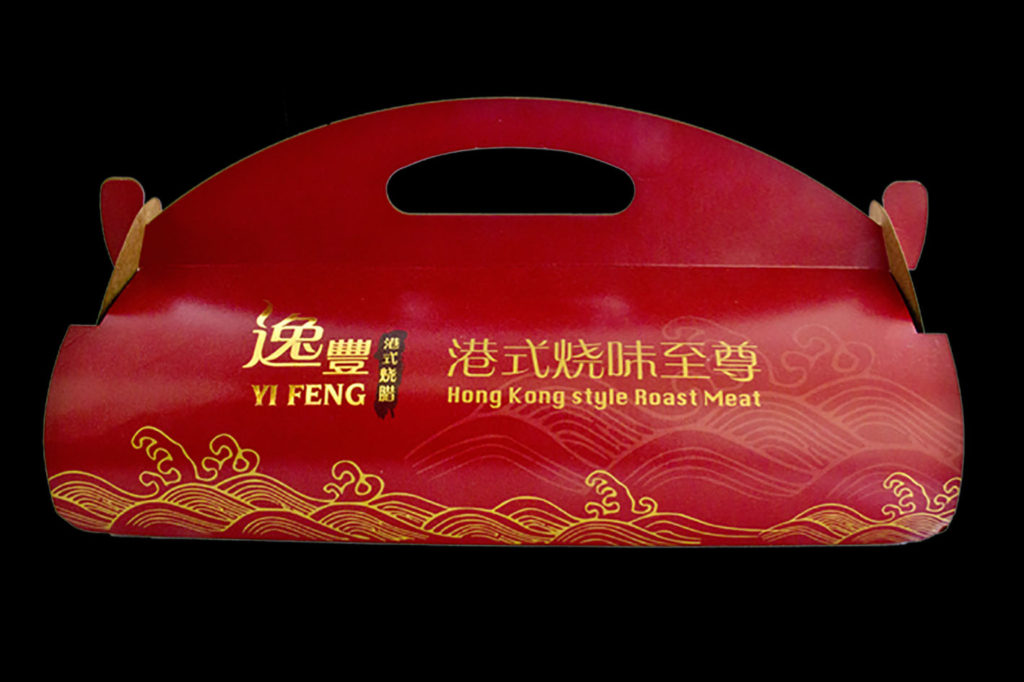
For example, gold foil stamping can give packaging a more premium and luxurious appearance.
3D Spot UV can add a raised, glossy effect that attracts attention to selected areas of the packaging.
These finishing effects should be clearly identified in the artwork.
In Illustrator, we can use separate layers and colours to indicate the areas that require gold foil stamping, Spot UV, embossing or debossing.
We normally prepare a separate finishing artwork or clearly labelled layer so that the production team can easily identify where the finishing should be applied.
Clear artwork separation helps reduce mistakes during production.
9. What If Your Artwork Is Not Print-Ready?
Artwork that is not completely print-ready is quite common.
That is one reason why we have an in-house designer to check the artwork before printing.
For example, we may find that the artwork has no bleed, the finishing area has not been indicated, an image is too low in resolution or there is a problem with the dieline.
When we find a problem, we normally inform the designer and ask them to make the necessary changes.
Part of the reason is that the original designer has the original editable artwork.
More importantly, we believe the designer should make changes to his or her own design whenever possible.
This also helps the designer learn from the mistake.
The next time they prepare packaging artwork, they will know what to check.
10. Preparing Your Artwork for Packaging Box Printing
Good packaging starts with good artwork.
Before sending your final artwork to a packaging box printer, check that:
The artwork is supplied as a high-resolution PDF.
Fonts are outlined.
Images are high resolution and suitable for printing.
Images are in CMYK where required.
The correct dieline is used.
At least 3mm bleed is provided where required.
Colours are clearly specified as CMYK or Pantone.
Special finishing areas are clearly indicated.
The final artwork has been carefully checked before printing.
At Uniquelink, we do not believe that our job is simply to print whatever artwork we receive.
We believe a good packaging box printer should also check the artwork before production.
A few minutes spent checking a final artwork can prevent a much bigger problem later.
Whether you are printing a simple product box or a high-end custom packaging box with special finishing, properly prepared artwork will help ensure that your packaging is printed accurately and looks the way you intended.
If you are looking for Packaging Box Printing Malaysia, make sure you work with a printer that understands both the printing process and the artwork behind it.