Why Use Pantone Colour?


Eye-catching packaging, design and printing in Malaysia
I remember having a meeting with an international company. The client took out his name card and brochure and asked me why the logo colours were different. I explained that they were printed by two different printing companies, which is why the colours did not match.
In Malaysia, this is actually quite common. Many companies experience inconsistent logo colours, especially when they use different printing vendors. It becomes even more likely if you engage a ‘runner’ to handle your printing. These agents do not own a printing press themselves. They simply pass the job to any available printer and often do not check if the colours are correct. This can lead to mismatched logos, uneven brand identity, and a less professional appearance.
If you want your logo colours to stay consistent across different printers, the best solution is to use Pantone colours. When printing companies follow the Pantone code correctly, the logo colour will match every time. Pantone guarantees that the colour you choose will be reproduced accurately, no matter where or how it is printed.
Pantone started as a small printing company in New Jersey in the 1950s. Later, Lawrence Herbert developed the Pantone Matching System (PMS), which became a universal colour standard for designers and printers around the world.
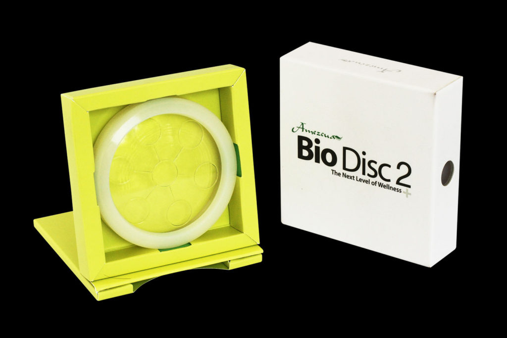
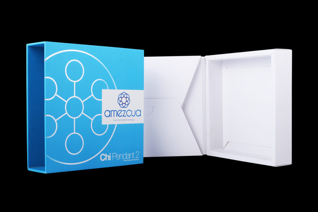
Pantone provides unique reference codes for each colour, including metallics, silvers, and fluorescents. These are pre-mixed colours that ensure consistency across different printers and locations. That is why Pantone is widely used in packaging box printing Malaysia. It helps businesses maintain a professional and cohesive brand appearance.
Colour is a major part of brand identity. When your colours are inconsistent, it can confuse customers and weaken recognition. Packaging that does not look professional can make customers doubt the quality of your products. Pantone solves this problem by providing standardised colours that are identical no matter where they are printed.
Using Pantone colours offers several advantages. First, it guarantees accurate and consistent colours. Think of iconic brands like MILO green — the colour is instantly recognisable. Pantone allows your packaging to achieve the same reliability.
Second, Pantone offers unique colours that stand out. Metallics, silvers, and fluorescents cannot be reproduced with regular CMYK printing. These special colours make your packaging more eye-catching and memorable, helping your product shine on crowded shelves.
Third, consistent colours strengthen your brand identity. When your packaging and marketing materials all use the same colours, it builds customer trust and reinforces your brand image.
Using Pantone does come with some challenges. Printing with Pantone usually costs more because it requires additional printing plates. For example, if you add two Pantone colours on top of CMYK, your printer may need to use six colours in total, increasing production costs.
Another limitation is digital proofing. Pantone colours cannot be fully represented on screens. To see the exact colour, a press proof is needed, where the colour is printed on the actual press. Most printers provide a CMYK simulation as a reference, but it is not 100% accurate.
Even with these drawbacks, the benefits of consistent, vibrant colours often outweigh the extra cost, especially for premium packaging.
CMYK mixes four inks — cyan, magenta, yellow, and black — to create colours. Slight variations can happen from printer to printer, which makes consistency difficult. Pantone, on the other hand, uses pre-mixed solid colours. This ensures the colour is exact and repeatable.
Pantone is especially ideal for premium packaging because it produces solid, vibrant colours that remain consistent across multiple printers. If you want your packaging to look professional, premium, and visually striking, Pantone is the better choice.
To use Pantone effectively, first identify your brand’s primary colours. Then, select the corresponding Pantone codes for each colour. Always share these codes with all printing vendors. If exact verification is needed, request a press proof to see the true colours before mass printing.
By following these steps, your packaging will look professional, consistent, and appealing to customers.
Pantone colours are essential for businesses in Malaysia that want high-quality, consistent, and eye-catching packaging. Unlike CMYK, Pantone offers pre-mixed colours that are solid, vibrant, and identical across multiple prints. Using Pantone ensures your brand stands out, builds trust, and leaves a lasting impression on your customers.
For professional packaging box printing Malaysia, Pantone colours are the best way to make your packaging look unique, professional, and unforgettable. Talk to us today to learn how Pantone can elevate your packaging and strengthen your brand.
24 & 26, Jalan PBS 14/6, Taman Perindustrian Bukit Serdang, 43300 Seri Kembangan, Selangor Darul Ehsan, Malaysia.
+603-8941 5531
© 2026 Packaging Box Printing in Malaysia. Built using WordPress and OnePage Express Theme.
One Response
Your article helped me a lot, is there any more related content? Thanks! https://accounts.binance.com/es-MX/register?ref=GJY4VW8W