Use Advertising in Your Packaging Design to Drive Sales

When we say advertising, most people think of TV commercials, newspapers, magazines, or billboards. These are traditional ways to reach a large audience.
But your packaging box design can also act as a powerful advertising tool. Every time a customer picks up your product, the packaging is speaking to them. If done correctly, it can influence their decision to buy.
Incorporating advertising concepts into your packaging gives your brand an extra advantage. It helps your product stand out in a crowded market.
Show Advertising in Packaging Box Design
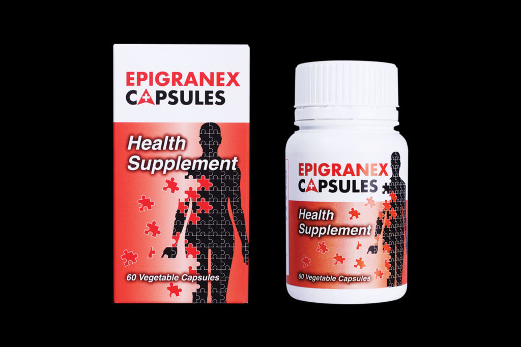
Take the example of a supplement for diabetic wound patients. Wounds like these can take a long time to heal, and nutrition plays a key role. Simply telling customers about the supplement is not enough.
We worked with the client to create a packaging box using a human puzzle concept. Each puzzle piece represented the missing nutrients that the supplement restores in the body. The design avoids graphic wound images but still communicates the purpose clearly. Red was chosen as the main colour to catch attention and signify healing.
The puzzle idea was applied to leaflets, magazines, and backdrops. Doctors and patients immediately recognized the human puzzle and associated it with the brand. Consistent advertising across all touchpoints strengthened product recall. Packaging is more than a container—it is a communication tool.
Healthcare products are a great example. Packaging must not only protect the product but also communicate trust, safety, and effectiveness. Using advertising on the box itself—through visuals, messaging, and colour—can reassure patients and caregivers that the product is reliable.
Tell a Story Behind Your Brand
Packaging can tell a story that resonates with your audience. Take the example of Bayu tea, a local Malaysian brand competing with international brands like BOH and Lipton. The client wanted to appeal to rural Malay consumers while showing that it was made locally and offered good value.
The packaging featured the Cameron Highlands tea plantations shaped like a tea leaf. A glass of tea spilling out made the product look fresh and exciting. The brand name “Bayu,” meaning wind, conveyed relaxation and enjoyment.
The storytelling worked. Customers tried the tea, and many continued buying it because the packaging made them feel confident. Good packaging tells a story that connects with your audience, making them more likely to choose your product.
Food products often benefit from this approach. A snack brand might show the source of its ingredients or the joy of eating the product. A bakery might highlight how its bread is handmade or baked fresh daily. When customers see a story they can connect to, it creates trust and adds value.

Choose the Right Strategy
Understanding your target audience is critical. Consider two hot chocolate brands in Malaysia long ago: MILO and Ovaltine. MILO focused on children, using sport as the main advertising theme. The message was clear: drinking MILO makes children healthy and active. Green was used as the main colour to represent health and growth.
Ovaltine, on the other hand, struggled because it didn’t establish a strong theme. MILO had already captured the idea of sports and health in consumers’ minds.
This shows why choosing the right strategy is essential: it helps customers remember your product and understand its benefits quickly.
The same strategy applies to premium products like watches, perfumes, or chocolates. High-end packaging should communicate exclusivity and quality. Metallic foils, embossed logos, and minimalist designs help signal value. Consistent messaging ensures the target audience knows why this product is special.
Your Logo and Brand Image
A key rule in advertising is to make your logo prominent. It should be the first thing customers notice. Other design elements should support, not overshadow, your logo.
Colour also plays a major role in brand perception. MILO’s green represents health and growth, while Ovaltine uses red. Even though both colours are memorable, MILO’s green aligns better with its message of strength and nutrition.
For food and beverage brands, colours like red and yellow stimulate appetite, while natural products often use green or brown to signify eco-friendliness. For premium products, black, gold, or silver conveys elegance and luxury. Choosing the right colour reinforces your product’s USP and ensures instant recognition.
Be Single-Minded
Sometimes, less is more. Print finishing techniques like foil stamping, spot UV, embossing, or lamination can make packaging look premium. But too much decoration can distract from your advertising message.
Think of it like a sports car. Adding too many accessories can make it flashy but take attention away from the engine—the main feature. On packaging, your USP is the engine. Keep the design focused on that message. Any finishing touches should complement, not compete with it.
Being single-minded also helps when targeting specific audiences. If your product is for children, bright visuals and playful elements are enough. Adding metallic foils or embossing might impress adults but confuse the target market. Highlight the main message clearly.
Eco-Friendly Packaging
Sustainability is increasingly important in Malaysia. Many brands now use FSC® Certified printing to show corporate responsibility and care for the environment. Customers today are more likely to choose eco-friendly products.
Seeing the FSC® logo on packaging reassures customers that your brand values ethical practices. Eco-friendly packaging also becomes a marketing point. It shows your company is responsible, modern, and in tune with global trends.
Final Thoughts
A Creative Director I worked with years ago never judged packaging solely on appearance. He always asked: “What is the strategy behind this design?”
Packaging with a strong advertising strategy can sell your product. Choosing the right target audience, telling a story, highlighting your USP, using the correct colour and logo, and considering eco-friendliness all work together to make a lasting impression.
In today’s competitive market, packaging is more than a box—it’s a silent salesperson. Done right, it can make customers remember your brand and keep coming back.
If you want to create packaging that truly sells in Malaysia, please contact us for expert guidance in packaging box printing Malaysia. Our team will help you design packaging that communicates your brand story, highlights your product’s unique benefits, and captures customer attention.
One Response
Thank you for your sharing. I am worried that I lack creative ideas. It is your article that makes me full of hope. Thank you. But, I have a question, can you help me?