Many years ago, one night we were rushing to finish a packaging box printing job for a client. The designer came by our factory to check the printed colours. He took out his laptop and compared the printed box with the image on his screen. Then he asked why the colours were not the same.
We had to explain something very important. The laptop screen uses RGB colour, but packaging box printing is done in CMYK. No matter how good the screen or the printing machine is, the colours will never match exactly.
We couldn’t really blame the designer. He worked for an international agency and probably showed the colours to his client on his laptop. The client insisted that the screen colours were exactly what they wanted. But in real life, CMYK printing can never match RGB screen colours perfectly.
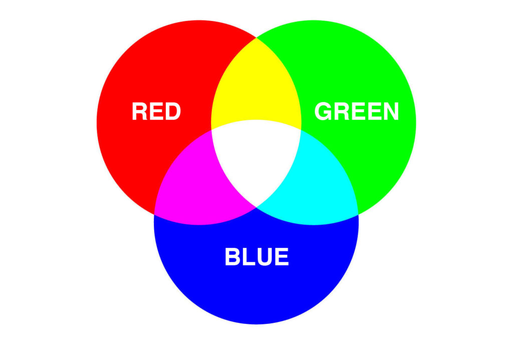
What is RGB Colour?
RGB is the colour system used on electronic screens like laptops, smartphones, iPads, and televisions. RGB stands for Red, Green, and Blue. These three colours mix in different ways to create all the colours you see on screen.
If you are a web designer and only work on screens, RGB works perfectly. You don’t have to worry about colour differences. But if you take an RGB image and use it for CMYK printing, the colours often look dull. Sometimes it seems like the image does not have enough black. This can make your printed packaging or brochure look flat and unprofessional.
Another advantage of RGB is that files are smaller. Since only three colours are used, the file size is lighter and easier to manage on your computer.
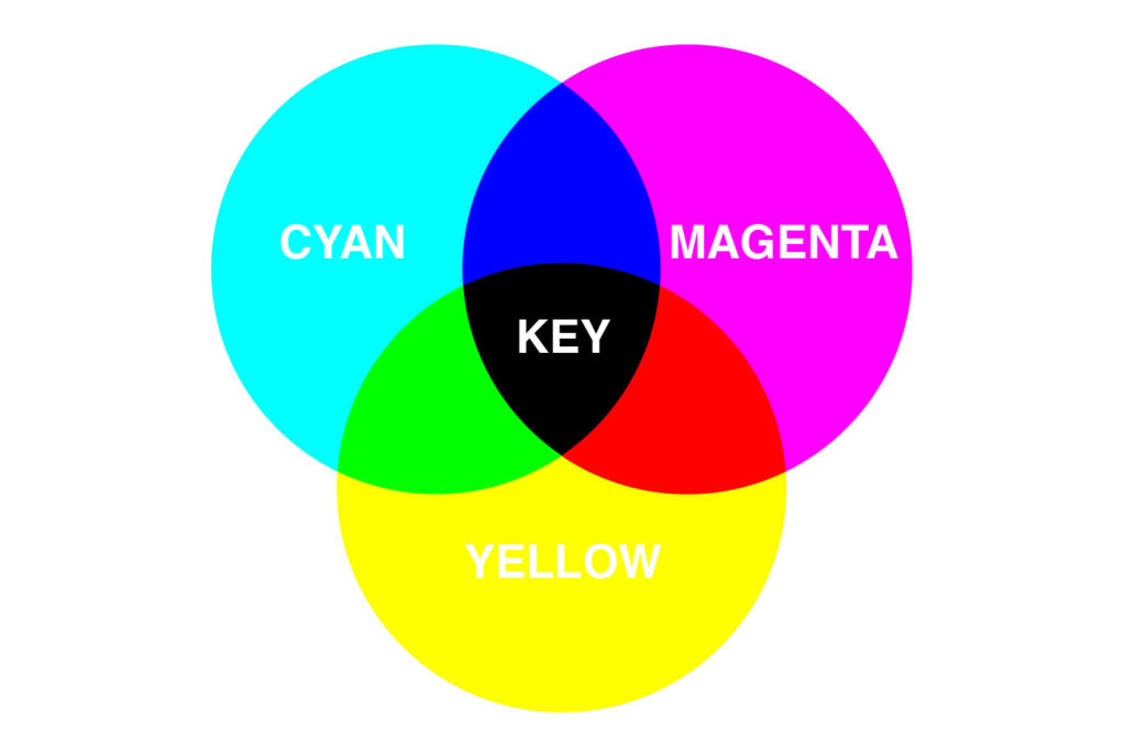
What is CMYK colour?
CMYK is the colour system used for printing. It has four colours: Cyan, Magenta, Yellow, and Black (also called Key).
CMYK works like mixing paints. Magenta and yellow make red. Cyan and yellow make green. Cyan and magenta make purple. To make darker colours, you add black. To get a solid black, you can mix a little cyan, magenta, and yellow with black. That is why “K” stands for Key, which is just another name for black.
CMYK files are usually larger than RGB files because they contain more colour information needed for printing.
Adjusting Colours in CMYK
When I was an art director, I would go to the colour separator to check images on their high-end monitors. These monitors were calibrated to match the printing machine. At that time, the usual method was to adjust images in RGB first, then convert to CMYK before printing. I followed that method for many years.
Then one day, my colleague at Uniquelink told me a different approach. He said it was better to convert images to CMYK first, then do all colour adjustments. This way, you avoid problems that come from using RGB images for printing.
Now, I always follow this method. Converting to CMYK first and adjusting the colours ensures that the printed packaging box looks exactly as intended.
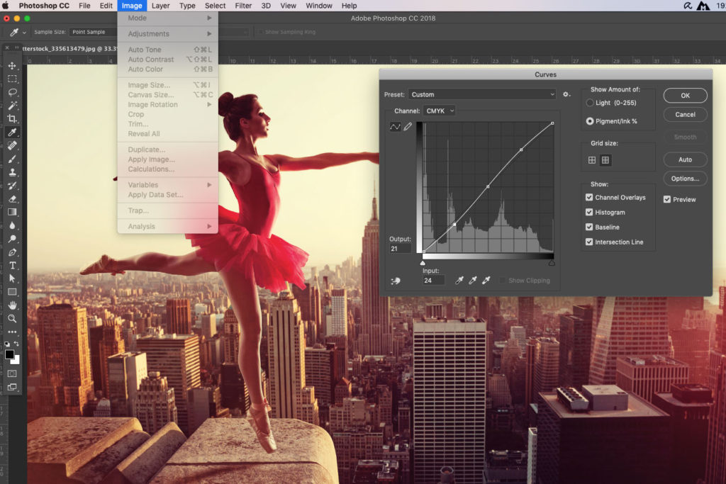
How to Adjust Colours
We normally use Photoshop to adjust colours. The simple way is to convert the image to CMYK first. Then check the colours.
If the image looks too blue, reduce cyan. If it looks too red, reduce magenta. If it looks yellowish, reduce yellow. Once the colour looks right, slightly increase the contrast to make it pop. Usually, curving the middle line a little — higher on the right, lower on the left — works well.
A little more contrast helps the image stand out on the packaging. It is also helpful to use a good monitor, like Viewsonic, for colour checking. Accuracy won’t be perfect, but up to 80% is usually enough to produce professional-looking prints.
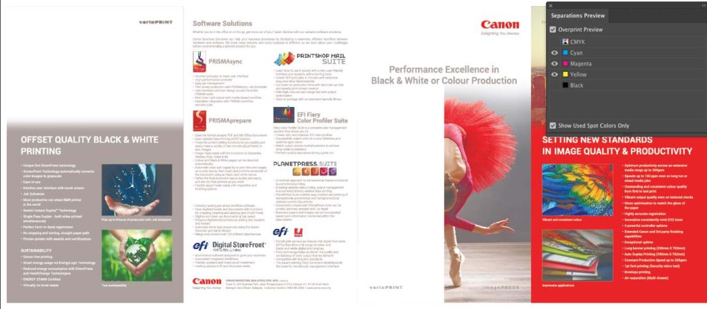
Fonts must be colorless in separation preview once black is unselected.
Common Mistakes to Watch Out For
Apart from using RGB images, another common mistake is using CMYK black incorrectly. This often happens when low-resolution PDFs are converted to Illustrator files. The black may include other colours without you noticing.
You cannot tell just by looking at the screen. The only way to check is in Illustrator using Window > Separation Preview. Uncheck black. If other colours appear, your black is not solid.
Printing packaging boxes or brochures with black that is not solid looks unprofessional. The black may have tints of other colours, and it can ruin the overall look.
Conclusion
Technology has made it easier to prepare files for printing. Today, most high-quality print PDFs automatically convert images to CMYK. But it is still important to check and adjust the CMYK colours so your packaging or brochure looks its best.
Whether you are printing packaging boxes, brochures, or leaflets, we always check your artwork to make sure printing is smooth and the colours are right.
If you have questions about RGB and CMYK printing, give us a call. We are happy to explain and help you make your printing look professional and high-quality.
4 Responses
Your point of view caught my eye and was very interesting. Thanks. I have a question for you. https://accounts.binance.com/en-ZA/register-person?ref=B4EPR6J0
Thanks for sharing. I read many of your blog posts, cool, your blog is very good. https://www.binance.com/ru/register?ref=O9XES6KU
Can you be more specific about the content of your article? After reading it, I still have some doubts. Hope you can help me.
Can you be more specific about the content of your article? After reading it, I still have some doubts. Hope you can help me. https://accounts.binance.com/es-AR/register?ref=UT2YTZSU